This is the hands-on companion to my earlier post, Understanding SARIMAX Outputs. That article explains how to read a model summary; this one walks through the full pipeline that produces one — on real store sales data, from raw CSV to a forecast with confidence intervals.
The dataset is the Kaggle Store Sales Forecasting competition data (Corporación Favorita, an Ecuadorian grocery retailer): daily sales for 54 stores across 33 product families, plus an onpromotion flag and a holiday calendar. The full pipeline below is written as a Jupyter notebook; here it is as a single narrative.
1. Setup
import matplotlib.pyplot as plt
import seaborn as sns
import pandas as pd
import numpy as np
from sklearn.metrics import mean_absolute_error, root_mean_squared_error

import statsmodels.api as sm
from statsmodels.tsa.seasonal import seasonal_decompose
from statsmodels.tsa.stattools import adfuller, acf, pacf
from statsmodels.graphics.tsaplots import plot_acf, plot_pacf
from statsmodels.tsa.arima_process import ArmaProcess
from statsmodels.tsa.arima.model import ARIMA
from statsmodels.tsa.statespace.sarimax import SARIMAX

import warnings
2. Load the data
oil = pd.read_csv("oil.csv")                              # daily oil prices
sample_submission = pd.read_csv("sample_submission.csv")
df = pd.read_csv("train.csv")                             # store × family × day sales
holidays = pd.read_csv("holidays_events.csv")
The training table has one row per store, family, and date. df.info() shows the usual mix — store_nbr, family, onpromotion (number of promoted items that day), and sales.
3. Exploratory analysis: pick a series
First, total sales by product family:
sns.barplot(data=df, x="family", y="sales", estimator="sum", errorbar=None)
plt.xticks(rotation=90, ha="right")
plt.show()
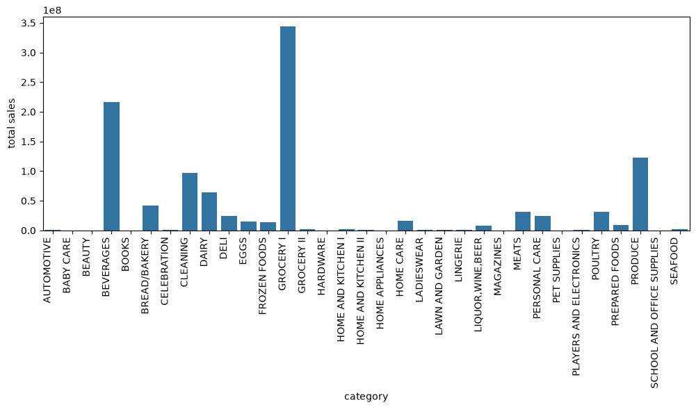
GROCERY I dominates — it’s the everyday-staples category, so it has the highest volume and the most stable weekly pattern. That makes it a good candidate for a first SARIMAX model. I also pick a single store (store 46) so we’re modelling one clean daily series rather than a panel:
category = "GROCERY I"
store_number = 46

df["date"] = pd.to_datetime(df["date"])
store_cat_sales = df[(df["family"] == category) & (df["store_nbr"] == store_number)]

series = store_cat_sales.set_index("date").sort_index()[["sales", "onpromotion"]]
series = series.asfreq('D').interpolate('time')
asfreq('D') forces a regular daily frequency (the raw data only has rows for days a store actually traded), and interpolate('time') fills any remaining gaps sensibly.
4. Stationarity: visual, then statistical
The core question before any ARIMA-style model: is the series stationary? (Constant mean, constant variance, no trend or seasonality left.) Look at the raw series versus two transforms:
fig, ax = plt.subplots(3, 1, figsize=(12, 6))
sns.lineplot(data=series, ax=ax[0])
sns.lineplot(data=series.diff(1), ax=ax[1])
sns.lineplot(data=series.diff(7), ax=ax[2])

ax[0].set_title("sales")
ax[1].set_title("sales - seasonal diff(1)")
ax[2].set_title("sales - seasonal diff(7)")
plt.tight_layout()
plt.show()
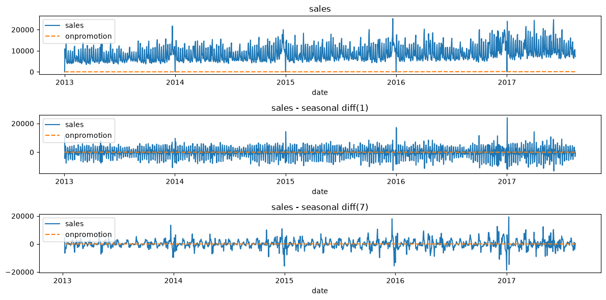
- Raw: trend + strong weekly seasonality + holiday spikes → clearly non-stationary.
- diff(1): trend gone, but the weekly cycle is still visibly pulsing.
- diff(7): comparing each day to the same day last week removes the weekly pattern — what’s left looks like noise. This is the transform the model will ultimately want.
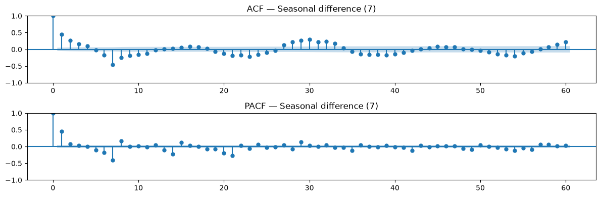
Confirm with the ACF/PACF of the seasonally differenced series, and the ADF test:
diffed = series["sales"].diff(7).dropna()

fig, axes = plt.subplots(2, 1, figsize=(12, 4))
plot_acf(diffed, lags=60, ax=axes[0], title="ACF — Seasonal difference (7)")
plot_pacf(diffed, lags=60, ax=axes[1], title="PACF — Seasonal difference (7)", method="ywm")
plt.tight_layout()
plt.show()
def adf_report(x, label=""):
    results = adfuller(x.dropna(), autolag="AIC")
    print(f"--- ADF test: {label} ---")
    print(f"ADF statistic: {results[0]:.4f}")
    print(f"p-value: {results[1]:.4f}")
    for k, v in results[4].items():
        print(f"  critical value ({k}): {v:.4f}")
    if results[1] < 0.05:
        print("=> Reject H0: series looks stationary\n")
    else:
        print("=> Fail to reject H0: series looks non-stationary\n")

adf_report(series["sales"], "total_sales")
adf_report(series["sales"].diff(7), "total_sales first difference")
The ADF test on the raw series fails to reject the unit root (non-stationary), while the seasonally differenced series comfortably rejects it (p < 0.05). That justifies a seasonal difference of 7 — i.e. D=1, s=7 in the model order.
5. The onpromotion regressor
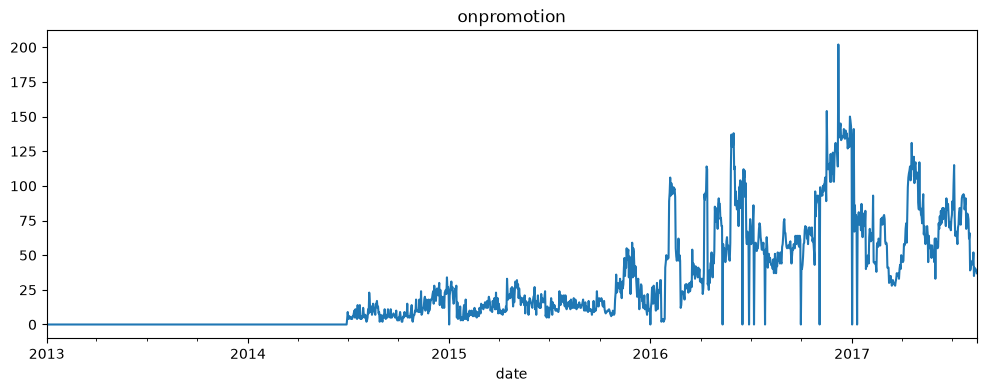
Before fitting, it’s worth looking at the promotion flag we plan to feed the model as an exogenous variable — how often promotions run, and how bursty they are:
print(series["onpromotion"].info)
series["onpromotion"].plot(figsize=(12, 4), title="onpromotion")
6. Fit SARIMAX with an exogenous regressor
Two refinements before fitting:
- Log transform. Sales are large and right-skewed;
log1pstabilises variance and makes errors interpretable in percentage terms. - Exogenous
onpromotion. Promotions drive sales; feeding the flag asexoglets the model absorb those spikes instead of leaving them in the residuals.
# SARIMA model
test_size = 60

# missing value handling
series[series["sales"] == 0] = np.nan
series.loc[series["onpromotion"].isna(), "onpromotion"] = 0

# log transformation
series["log_sales"] = np.log(series["sales"] + 1)

# SPLIT TRAIN AND TEST SETS
train = series.iloc[:-test_size].copy()
test = series.iloc[-test_size:].copy()

# SARIMAX model with exogenous variable (onpromotion)
model = SARIMAX(
    train["log_sales"],
    order=(1, 1, 1),
    seasonal_order=(0, 1, 1, 7),
    enforce_stationarity=False,
    enforce_invertibility=False,
    exog=train["onpromotion"]
)
results = model.fit()
print(results.summary())

# Forecast and invert log transformation back to original scale
log_forecast = results.forecast(steps=test_size, exog=test["onpromotion"])
forecast = np.expm1(log_forecast)  # Inverts np.log1p
The summary output is exactly what the interpretation guide walks through — coefficients, p-values, AIC/BIC, residual diagnostics.
7. Residual diagnostics
A good model leaves nothing but noise in the residuals — check this before trusting any forecast:
# Get the residuals from the model results
residuals = pd.DataFrame(results.resid)

fig, axes = plt.subplots(1, 2, figsize=(15, 5))

# Plot the residuals over time
axes[0].plot(residuals)
axes[0].set_title('Residuals Over Time')
axes[0].set_xlabel('Date')
axes[0].set_ylabel('Residual Value')

# Plot a histogram of the residuals
axes[1].hist(residuals, bins=30)
axes[1].set_title('Histogram of Residuals')
axes[1].set_xlabel('Residual Value')
axes[1].set_ylabel('Frequency')

plt.tight_layout()
plt.show()
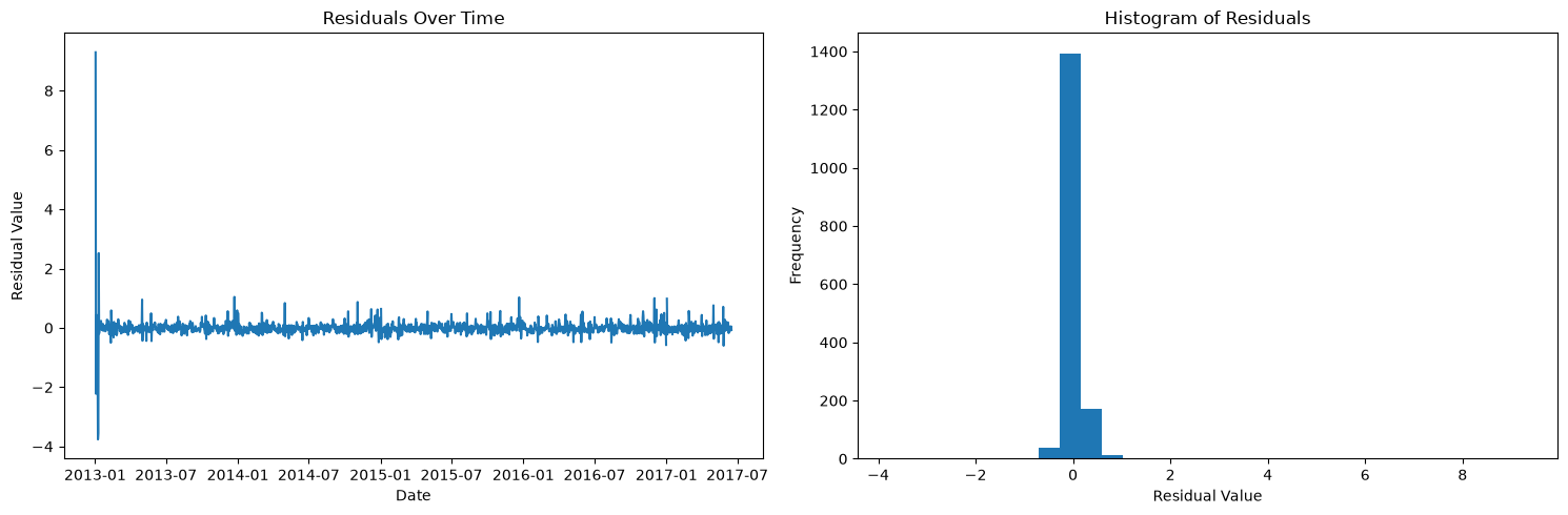
The residuals hover around zero with no visible trend — no obvious unmodeled pattern left in the bulk of the series.
8. Forecast and invert the transform
Forecasting on the log scale, then inverting with expm1 (the exact inverse of log1p) to get back to real sales units — and clipping at zero so the confidence interval never goes negative:
# --- 1. Generate Forecasts for the test set ---
# exog features ('onpromotion') for the test horizon
test_exog = test[["onpromotion"]]

forecast_object = results.get_forecast(steps=len(test), exog=test_exog)
log_forecast = forecast_object.predicted_mean
confidence_int_log = forecast_object.conf_int()

# --- 2. Invert Log Transformation Back to Original Scale ---
# Using np.expm1 to match np.log1p (expm1(x) = exp(x) - 1)
y_pred = np.expm1(log_forecast)

# Convert prediction interval back to original scale
lower_bound = np.expm1(confidence_int_log.iloc[:, 0])
upper_bound = np.expm1(confidence_int_log.iloc[:, 1])

# Clip bounds and predictions at zero to prevent impossible negative sales
y_pred = np.maximum(y_pred, 0)
lower_bound = np.maximum(lower_bound, 0)

# --- 3. Compute Accuracy Metrics on Real Sales Scale ---
y_true = test["sales"]

mae = mean_absolute_error(y_true, y_pred)
rmse = root_mean_squared_error(y_true, y_pred)

print(f" Model Evaluation: SARIMAX(1,1,1)(0,1,1,7)")
print(f" Forecast Horizon: {len(test)} days")
print(f" MAE  : {mae:.2f}")
print(f" RMSE : {rmse:.2f}")

# Relative performance
mean_sales = test["sales"].mean()
mape = np.mean(np.abs((test["sales"] - y_pred) / test["sales"])) * 100
nrmse = (rmse / mean_sales) * 100

print(f"Average Daily Sales: {mean_sales:.2f}")
print(f"Mean Absolute Percentage Error (MAPE): {mape:.2f}%")
print(f"Normalized RMSE (NRMSE): {nrmse:.2f}%")
9. Visualise the forecast
# --- 1. Get Forecast and Confidence Intervals on Log Scale ---
forecast_object = results.get_forecast(steps=test_size, exog=test["onpromotion"])
log_forecast = forecast_object.predicted_mean
confidence_int_log = forecast_object.conf_int()

# --- 2. Invert Log Transformation Back to Original Scale ---
forecast_actual_scale = np.expm1(log_forecast)
confidence_int_actual = np.expm1(confidence_int_log)
lower_bound = confidence_int_actual.iloc[:, 0]
upper_bound = confidence_int_actual.iloc[:, 1]

# Ensure no negative sales values in bounds after inversion
lower_bound = np.maximum(lower_bound, 0)
forecast_actual_scale = np.maximum(forecast_actual_scale, 0)

# --- 3. Compute Metrics on Original Sales Scale ---
y_true = test["sales"]
y_pred = forecast_actual_scale

# --- 4. Plot Results ---
plt.figure(figsize=(12, 6))

# Plot recent training data (e.g., last 120 days for context)
plt.plot(train.index[-120:], train["sales"].tail(120),
         label="Train (Recent)", color="#2b5c8f")

# Plot actual test sales
plt.plot(test.index, y_true, label="Test Actuals", color="#333333", linewidth=2)

# Plot point forecast
plt.plot(test.index, y_pred, label="SARIMA Forecast",
         color="#d95f02", linewidth=2, linestyle="--")

# Plot confidence interval (shaded region)
plt.fill_between(test.index, lower_bound, upper_bound,
                 color="#d95f02", alpha=0.2, label="95% Confidence Interval")

plt.title("SARIMA Sales Forecast vs. Test Actuals", fontsize=14, fontweight="bold")
plt.xlabel("Date", fontsize=11)
plt.ylabel("Sales", fontsize=11)
plt.legend(loc="upper left")
plt.grid(True, linestyle=":", alpha=0.6)
plt.tight_layout()
plt.show()
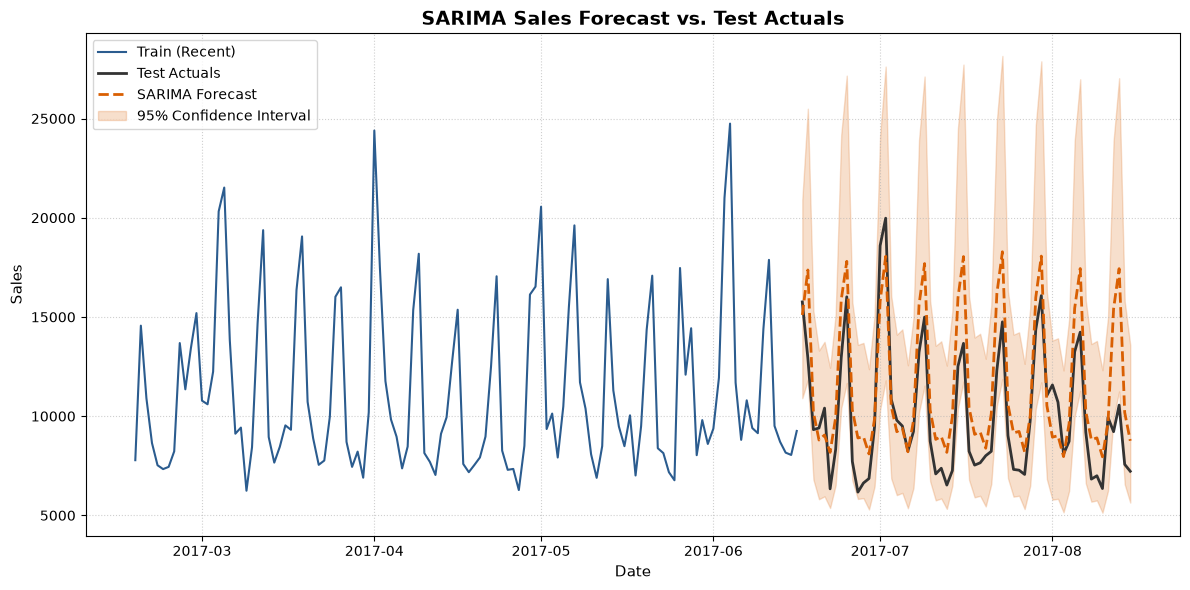
The forecast tracks the weekly rhythm of the actuals well, and the 95% band widens slightly over the 60-day horizon as uncertainty compounds — exactly what you’d expect.
Summary
The pipeline, end to end:
- Pick one clean series (a high-volume family at a single store) and force a regular daily frequency.
- Establish stationarity visually and statistically — differencing plots, ACF/PACF, and the ADF test justify
d=1, D=1, s=7. - Fit SARIMAX on log-transformed sales with
onpromotionas an exogenous regressor. - Check the residuals before trusting anything — no trend, no leftover pattern.
- Forecast, invert with
expm1, clip at zero, and score with MAE/RMSE/MAPE on the original scale.
The full notebook is the companion to the SARIMAX interpretation guide — the guide tells you how to read the summary, this walkthrough tells you how to produce a summary worth reading.
📄 Prefer reading offline? Download the original notebook — runnable Jupyter notebook, same code.